

Why Finland, Norway, & Sweden Are the Least Happiest Countries in this Ranking
Arbitrary indicators, dubious choices, random weights, overstated studies, biased presentation—this essay shows how rankings are not science.

It seems like every week there is some new ranking that gets released and posted online. The best something, the worst something, the top something, the X something. We love rankings! They make abstract ideas easier to understand through a direct comparison on a single number, a process we call commensuration.
The numbers used in rankings make us believe that these must be smart, thoughtful, and objective. This is the crux of Theodore Porter’s Trust in Numbers, highlighting how these constructs are often built from flimsy metrics that are mostly subjective and not scientific.
Just this past week, U.S. News & World Report released its university rankings, which make waves in higher ed every year. University leaders fight so hard to ensure their institutions have good showings in this magazine’s score. Some even risk going to jail over the ranking! Unfortunately, universities must pay some attention, as students and parents use the rankings in decision-making.
Like any form of commensuration, university rankings end up losing so much context, as the simplistic indicators are socially constructed and rationalized at best, and biased at worst. They also use arbitrary indices with random weights that are not tested for internal consistency, like Cronbach’s alpha, failing some statistical basics.
There are rankings like this in every sector, not just higher ed. A lot of them have the exact same problems as with university rankings. To illustrate their absurdity, I decided to create my own ranking of happiness by country, with some ridiculous results.
There is a funny stereotype about these kinds of global indicators always having the exact same pattern: Scandinavian countries at the top in all of them. Finland, especially, is known as the happiest place on earth (the real one, not Disneyland).
I don’t have anything against Finland or the Scandinavian countries, but I just thought it would be a fun part of the challenge to see them ranked at the bottom of a global happiness index. So these were my goals:
Create a global happiness index ranking.
Use reasonable metrics with as many countries as possible.
Back the choices with real research (found in links).
Have the Scandinavian countries ranked at the bottom.
Below, I present to you the Real Happiest Countries Ranking.
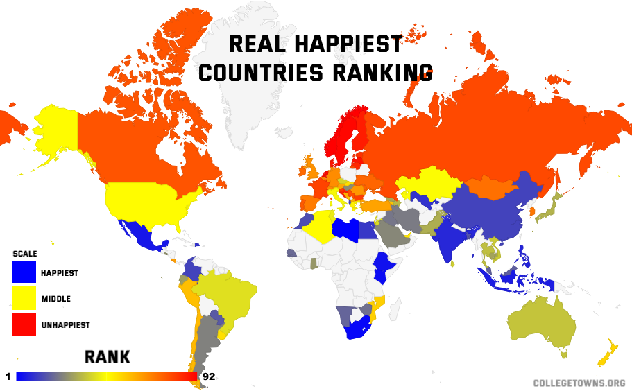
Real Happiest Countries Ranking
The Real Happiest Countries Ranking (RHCR) is one of the most comprehensive rankings of national happiness in the world. The metric is backed by both academic research and practical application.
According to the RHCR, the least happiest countries in the world are Norway, Sweden, and the Netherlands. In general, the Scandinavian countries, including Finland and Denmark, are unhappy, according to the metric. These countries are considered unhappy due to a combination of their relatively expensive living cost, cold and gloomy weather, disposition on life, and other negative behaviors.
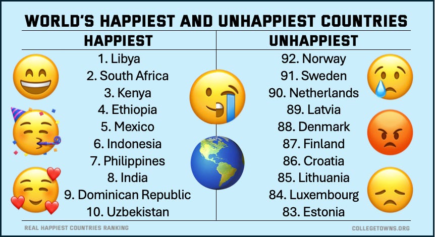
The happiest countries in the world are not centered around a singular region, unlike those of the unhappiest. Although the continent of Africa does dominate the top three, the countries come from different, distinct regions. The happiest countries are Libya, propelled by its Mediterranean climate, South Africa, and Kenya, both with positive dispositions. Other regions such as North America with Mexico, Southeast Asia with the Philippines and Indonesia, Indian in South Asia, and Uzbekistan in Central Asia also round out the diverse list.
Methodology Behind RHCR
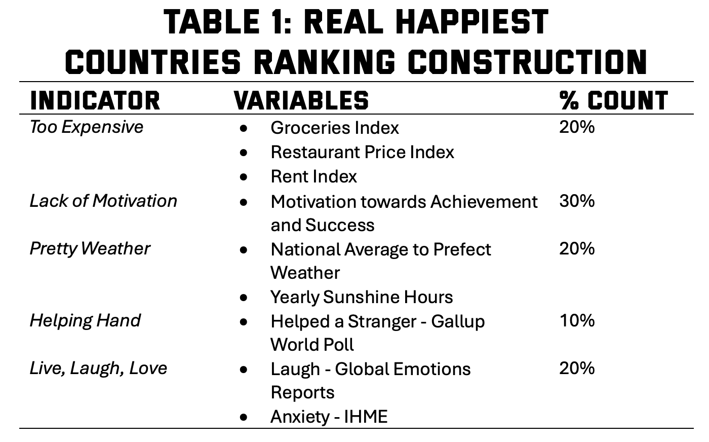
For the Real Happiness Countries Ranking (RHCR), we use five scientifically-backed metrics to measure our countries’ level of happiness: Too Expensive, Lack of Motivation, Perfect Weather, Helping Hand, and Live, Laugh, Love. Each metric has been meticulously chosen by a leading team of PhD researchers, gathered from across a range of variables and indicators from top data centers or think tanks, to precisely weigh the global comparison.
Unlike some of the more traditional happiness indices, this Real Happiness Countries Ranking does not rely on respondent self-evaluation of happiness. In social sciences, self-evaluations can be some of the most biased types of data (Yates et al., 2022). The most common is the Cantril ladder, which simply asks respondents to state “their current position on a hypothetical ladder.”
Instead, we utilize observable data and actions, which are much more reliable metrics in the social sciences (Griffiths et al., 2023; Podsakoff et al., 2003). The key challenge in the selection of these variables was to find common variables that could be observed in every country around the world. This practice allows to have the most accurate ranking for global comparison.
The end result is a global comparison of 92 countries in terms of happiness, a comparable number to other peer rankings, but with more accurate indicators that are not direct self-evaluation of happiness. The ranking includes countries from every continent and region on earth, sans Antarctica.
Below is a breakdown of each indicator, along with the rationale:
Too Expensive
Research shows that finances are a leading cause of stress for people across the world (Roelfs & Shor, 2023). While it is certainly true that money cannot buy happiness, struggling with money can lead to unhappiness. For these Expense variables, we use data from Numbeo, “the world’s largest cost of living database.”
One of the biggest costs to any household comes from groceries and daily items, so our ranking uses the Groceries Index in the Expense metric. This measures the “cost of grocery items” to that of the world-famous expensive place, New York City, as the baseline.
Furthermore, research shows that eating out and having a meal with other people leads to greater happiness (Chen et al., 2024; De Neve et al., 2025). When restaurants are too expensive, this great happiness generator is cut off. This is why we include the Restaurant Price Index, which “compares the prices of meals and beverages in restaurants and bars” to the New York City baseline.
Finally, housing is globally one of the most burdensome budget items for people of all ages. Researchers have linked housing insecurity to a range of negative mental and physical health outcomes that hinder happiness. Given this obvious connection, we include the Rent Index, which again uses New York City as a baseline for comparison to the cost of renting.
These three variables make up the Too Expense indicator. Given the studies in this area, we consider that a higher score on this indicator is associated with lower happiness.
Lack of Motivation
Motivation is one key part of happiness. Research shows that happy people are more motivated and active compared to their more lethargic and apathetic counterparts (Ang et al., 2017). Sometimes, this kind of motivation has been dubbed Growth Mindset (Dweck, 2015; Yates et al., 2022). The connection to happiness and motivation is why we include Geert Hofstede’s Dimensions of Culture called Motivation towards Achievement and Success.
Hofstede is one of the most cited social psychologists on earth, both in and out of academia (see Hofstede, 2011). His Dimensions of Culture have been used to explore academic studies of countries from around the world, as well as a guide for global businesses navigating multi-billion dollar industries.
The Culture Factor Group, initially set up by Hofstede, uses the following definition for the Motivation towards Achievement and Success:
A high score on Motivation towards Achievement and Success indicates that the society will be driven by competition, achievement and success, with success being defined by the winner/best in the field - a value system that starts in school and continues throughout organisational life.
Given the immensity of Hofstede to both academia and business, we use this as the lone indicator for the Lack of Motivation variable. A higher score on this scale is considered to bring more happiness.
Pretty Weather
Seasonal affective disorder is a well-known phenomenon, in that the gloominess of winter brings a depressive mood until spring comes (Melrose et al., 2015; Flenderson, 2007). Likewise, research shows that getting sunlight can bring on positive moods associated with happiness. Given these relations to weather, we use a Pretty Weather indicator as a key metric in our ranking.
We rely on measures from the World Population Review, a repository for global datasets, for our weather data. First, we took the Average Summer Temperature and Average Winter Temperature to create a National Average. We then took the temperature researchers have found as ideal (74°F; 23 °C) and calculated the absolute value difference between the National Average. The further from this perfect temperature, the more unhappy.
Next, we took the Yearly Sunshine Hours from World Population Review and ranked them accordingly. The countries with the most sunshine were higher on this indicator, and thus happier.
Both of these indicators of weather were then combined together to provide the final Pretty Weather index for the happiness ranking. The closer a country is to Pretty Weather, the happier it will rank on our measure.
Helping Hand
Research shows that those who help out others are generally happier than those who do not (Aknin & Whillans, 2020; Weiss-Sidi & Riemer, 2023). It feels good to help others. This is why we have included a Helping Hand metric to capture the importance of helping in the happiness ranking.
Our Helping Hand measure comes from the Gallup World Poll, which is the leading public opinion survey group. The question asks if respondents have “helped a stranger in the last six months.” It is part of a broad battery of questions from Gallup on charity in general, which were mostly not included in our ranking due to cultural differences in expectations about charity giving (Stojcic et al., 2016).
We feel that the help a stranger question should be isolated and focused in our ranking, given the strength of research on this topic (Aknin & Whillans, 2020; Weiss-Sidi & Riemer, 2023). The countries that reported the highest percentage of respondents who had helped a stranger were higher on the happiness ranking.
Live, Laugh, Love
They say “laughter is the best medicine,” and we agree with the Real Happiest Countries Ranking. Research on laughter even supports the assertion that people who laugh or smile more are generally happier than those who do not (Mora-Ripoll, 2010; Ayan, 2009). This positive disposition can also have a peer effect on others around the happy person (Reavis et al., 2015). For these reasons, we introduce a Live, Laugh, Love measure in the ranking.
The first metric in the Live, Laugh, Love comes from Gallup; this time with the World’s Emotional Hotspots dataset and Global Emotions Reports. While the Report focuses on a range of emotions, we have selected the variable on laughing or smiling due to the association these actions have with happiness (Mora-Ripoll, 2010; Ayan, 2009). The following question was asked by Gallup:
Now, please think about Yesterday, from the morning until the end of the day. Think about where you were, what you were doing, who you were with, and how you felt. Did you smile or laugh a lot Yesterday?
The other part of our Live, Laugh, Love measure comes from Our World in Data, a global leader in data about various cultures. We used their anxiety disorders prevalence variable, which was constructed in conjunction with the University of Washington School of Medicine’s Institute for Health Metrics and Evaluation (IHME). They describe the measure as:
Anxiety disorders are defined by the [International Classification of Diseases] ICD as a group of conditions that involve feelings of intense fear and distress, along with other physical symptoms.
These conditions can be serious and relate to various aspects of depression. There are various reasons or causes, which we do not grapple with in the ranking, but there is no doubt that the presence of anxiety can be associated with unhappiness (Wasil et al., 2021; Schnittker, 2012).
Combining both the laugh variable together with the anxiety score can give us a precise measure of national mood in what we call the Live, Laugh, Love index. For those countries that laugh more and have lower percentages of anxiety will score higher on Live, Laugh, Love, ranking higher on the happiness ranking.
Putting the RHCR All Together
Table 1 displays the construction of the Real Happiest Countries Ranking and the weights of the various indicators. The Too Expensive, Pretty Weather, and Live, Laugh, Live indicators each account for 20% of the ranking measure. The Helping Hand indicator accounts for 10% of the happiness ranking. Finally, the highest percentage comes from the Lack of Motivation variable at 30%. Together, these make up 100% to compute the Real Happiest Countries Ranking.
Student Exercise: Create-Your-Own-Ranking
I always tell my students: you have to know the rules to break the rules. And I have broken every rule in the creation of this Real Happiness Countries Ranking. The exercise highlights some of the standard practices within the ranking world that are passed on as scientific fact. So many rankings are basically fake in the same way this one is. Here are a few of the RHCR sins:
Arbitrary indicators;
Dubious indices without statistical consistency;
Random weights;
Overstated studies;
Biased in the presentation and limitations;
Pleaded the credentials of the datasets (and my own).
For educators teaching aspects of social sciences, this exercise can be a nice project that teaches aspects of data management, Excel or statistical tools, AI usage, global governance, political sociology, and more. Here is how you can teach a lesson on this topic:
Teach aspects of commensuration, global rankings, and Trust in Numbers.
Choose a ranking metric or indicator (environmental or sustainability rankings are ripe for this exercise).
Break down the parts of the indicators used in famous examples.
Set a goal for ridiculousness (like Harvard below Bob’s College of Knowledge in university rankings).
Find measures to create your own ranking.
Rationalize choices through academic literature.
Create your own indices (can even teach Cronbach’s Alpha).
Combine the data and tweak rankings to get the desired outcome (AI can be useful here).
Write-up results and create a graphic.
Present to class and have a good laugh at learning.
So this is just a small lesson that might be fun to learn about these real concepts. If you want to do this or have some suggestions, please reach out. I would love to hear your ideas or how this went in your classroom.
This is awesome (as usual!)! I will definitely use this (with your permission and credit) in my classes. One thing I'd do if you want to take this further is talk about how rankings are in the business of keeping as many 'ranked players' as possible, 'happy' (pun intended)... You could talk about how in expanding their reach, they realize that it might be unfair to have one single ranking, so we should create at least a couple new happiness rankings that place nations in groups based on categories such as geography (happiest among the tropical countries?), income-level (who are the happiest among the 'rich' countries?), and so on...
Well played!